Typography What is Graphic Design?

In this project about typography i used some of the same tools in doing the what is graphic design. I learned about spacing letters and tracking and also keaning. I really enjoined doing this project. It was really cool learning about what typography and i will use this in the future.
|

|
In this project i answered 10 questions about "what is graphic design"
I used the pen tool, text tool, editing tool, and also how to re-size and
and most importantly my imagination was also a great tool to use it was
really cool doing this project and a learn a whole lot about what i was doing.
I used the pen tool, text tool, editing tool, and also how to re-size and
and most importantly my imagination was also a great tool to use it was
really cool doing this project and a learn a whole lot about what i was doing.

Here i learned the seven elements of art and design. It consisted of a line, shape, texture, color, value, space, and form. It was fun making this because i used some of the tools from my other projects to make this one look so good. I also learn that there are many designs in something like this or in other projects that include color and other parts of this texture list.

Here i used 10 different shapes and used backgrounds from the internet and was very fun to make and use what i knew to make this project. I enjoyed because i got to you different shapes to my liking to make an amazing creation. I used some 3D shapes for the bottom three pictures. And the rest i used the tools i learned to use in making this.

I used some of the same tools used in the other projects i made. like the pen and anchor tool to make these business cards. It was really fun doing this and i hope we do more projects like this later in the year. I spent a lot of time on this project and then again i really likes this project!

This was a holiday fair flyer i made for a casa grande high school type Christmas theme. I had a ton of fun making it. The reason is because i used the skills ive learned of the past 3 months of learning in GS that i really know how to make really cool designs. I also added some cool pictures as a better and more appealing design because i want more detail for my project and better to see and so people will like it better then if i didn't add all that much detail in this projects.

This project i did was for a client. This client wanted a unique logo for a business. So my team team A did a logo. and team B made their own logo. He wanted it to be a logo of his dental company. And so i added a sun and palm trees because that was part of his original logo for his company. He wanted a detailed logo of his dental company so it wouldn't look so boring and bland. So his main idea he had was for us to create a more interesting and creative logo for his company so people will be more likely to visit him.

I Had a ton of fun working in Photoshop and adding the things i like to do in my spare time. I hope i get to work in Photoshop more. Like Aaron Ross doin a wheelie. And the WeThePeople logo for BMX and a soldier At the top corner i added skateboarding brands and at the bottom a silhouette skater going off a ramp. And last SK8MAFIA a well known skateboard brand.

This is a project i did a while ago and forgot to upload it. But anyways I combined 5 animals into one animal. Almost like a morphed animal from like a science experiment. It was very fun creating this in Photoshop and also how cool it was after the finished project.
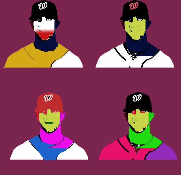
This was a pop art i made, This character is the famous Bryce Harper baseball player. I chose this because that's my name and i thought it was cool to do a person with my name. I used mainly Photoshop, actually that's all i used, It was very fun creating something like this, and i hope i create more things like this in the near future.

I made this project for a client who wanted some designs for casa lunches, So I used illustrator to make the classic lunch box design and the casa logos on the lunch box. I added the handle and the two latches for the lunch box. I had some fun doing this little projects and presenting it to my class. It was very fun because i added really good design so it looks more cool then the other students project and i tried really hard on it and that i used my imagination and i think that it was really cool that this project was assigned and that i really hope that i do something like this again before the school year is over because i get really fasinated in things like this because its apart of things that i really like to do. I spent a ton of time and that it was really cool there was only one thing that i really didn't like all that much the thing that i really didn't like was that it was so tedious and some parts of it was really annoying was that it took was the logos was hard to copy and paste because it wouldn't really fit in a specific way which can be really annoying from putting them in spacific i aslo really disliked was the problem was put in the borders on the lunch box. casas lunch boxes was really cool to express my self that i added spacific colors that would match the colors of the high school colors so it wouldn't look that nice and that wouldn't really look all that cool and i want it to keep it nice and neet looking because i want it to look as nice as posible and to get the highest grade and thats what i did for my lunch box project.

This is a shirt i created for an event called every 15 minutes, which means every 15 minutes somebody somewhere gets into a car accident, And in 2015 Casa is doing an event about this. So i created a shirt that represents death and not to take life for granted. And so this is what my project was. To create a t shirt that has do with this event.

In this project below I edited old pictures for another teacher, I used Photoshop and tools I used where the clone stamp tool and The Spot healing brush tool, This was a great Project and I had a lot of fun doing it. It was really cool to transform an Image from its original form to a new and improved cloned picture. I edited two different pictures as you also see on the left.
<---------------------
<---------------------

This is another project i did in Photoshop. I took two different pictures and then cleaned them up. I used the tools i mentioned above to get rid of all the unnecessary scratches and tares and other out of place details. It was a lot similar like the my other pictures i cleaned up.
|

|

|

|
In this project i did was making a black and white photo and adding 10 different colors. I used the masking tool and also the overlay feature. Its job was to blend in with the back round so it doesn't look sloppy or cheesy and badly done. So that was pretty cool using these features on the new macs we used today. Its a little bit different from the windows photoshop but i will get used to it. Before on the right and After on the left.

This was a project I did that was called human face animal. basically I took a person and an animal and put them together. I used a lion and a male face which you cant see anymore, I used Photoshop on the new Imac or class got about a week ago to make this. I used the same tools I use for any other Photoshop projects or creations. I also tried out a whole different types of addional effects with this new software i just learned how to use with the new computer we got. it was kinda of hard to use at the beggining but after using this new computer it started to get alot easier because i spent so much time on it and working on it all class and because it was apart of a grade to learn to use this new software but overall it was really fun because i got to use my imagination. It was also really cool because i got to use a brand new software that now i know how to use and very efectivley. So now when i have to do projects like this i know how to do it really quickly and very effectivly because ive used it so many times its like second nature to me and so i can use this awesome software at like the blink of an eye and its really cool to know that i can do that really quickly and successfully and thats really great to know in my opinion.

Today I made a Sartain's logo in Adobe Illustrator, it was pretty cool to make this custom logo for this company, I made the two chili peppers with the pencil tool, I used a warp tool and arched the words so they would rap around the logo. The before logo in the top left hand corner and the custom new and improved logo on the bottom right hand corner. It was a fun project to make. Today i made a 3d sartain bottle for this project it was really cool because it showed that i can learn how to make something really cool that it can start in sort of a 2d type structure and then start from there and then in like 20 minutes and then boom i can create it in a 3d type project which is really cool to me. I love to use my brain and create something so epic like this

the last 2 of the 3 part project on the the sartains logo is finished. The bottle was the best part of the project because i got to use a new setting called 3D. Where i made a 3D looking bottle for the logo i made. For the wrapper on the bottle i added my logo, A bar code, title, website, address and phone number, Ingredient, how much is in the bottle and some history behind the sartains franchise. It was really fun and time consuming but overall worth the time to make the final product.

I did the project/poster for "Link Crew Is Coming" which I have no idea what or who is is that my class is making these posters for. But anyways I had fun making it. I used 2 colors black and white, I copy and pasted a skull wearing a helmet because it looked cool. I used vector art and the pen tool to make it a higher quality image, And then I put Link Crew Is Coming at the top and bottom of the image in the middle of the poster. Then I put E9 DESI9N on the bottom right corner of the poster. This link crew project was kinda cool because i got to use the knowledge i know that i have learned over the mouths in my computer graphics class which im having a great time in by the way.

This is a project I did for the Casa Grande High School home web page. Its not a functional web page but it gives the reader or viewer an idea about what a customized web page can look like compared to the original or default web page. I added the 9 links or buttons at the top, I added the schools slogan " Informing Today, Transforming Tomorrow", Also including the schools address, zip code, and telephone number. I also added 6 info boxes and 6 pictures in the middle of the page to make it kinda unique or different from a basic home page. I hope I get a good grade on this because I spent a lot of time and effort in making this non-functional Casa Grande High school home page and so thats the project I did for my graphic design class.

This is the 2nd page of the first page of my casa grande website page. This current page I did was selecting one of the titles. I choose Athletics. Because its the most popular on the casa grande home page. I think its really cool that they add time and events to this athletic page or section. it was very fun creating a second page or section for this class project I started on the first day of school after spring break. Like adding 3 photos, the title, contacts, content and info about up coming events.

I did this t shirt design for an Elementary school. One of Mc Dowells employees or parents wanted my class to create a superhero logo for their school. So I used vector art and the pen tool to go around the superman logo to clean it up. So it doesn't look jagged or sloppy. Then I took a black t shirt and put the logo and "Mc Dowell superhero" below the logo. So I had a fun time doing this project/design for a school.

I created and finished this Casa Grande High School cover photo. I used layers of course, I used some bullet points and titles for the front cover. I included 4 of the titles on the Casa home page like Mission, Vision, Student Spotlight and added an additional title special events to the cover. I named the title The Big House and then Casa Grande High School at the bottom and included the their slogan "Informing today, Transforming Tomorrow". And so yah thats about it on the Casa Grande High School cover page project.

Today I used in-design to make a Big house magazine double page spread, I had a ton of fun making this project I actually spent time in making the words in the 8 columns make sense instead of using an out type tool that fills in words that don't make sense. I hope a get a little bit of extra credit for it. I added 6 pictures and a 2 for 1 page cover. I used both in-design and photoshop to make this. And then I put in on an i pad, like a webpage or an app. But anyways it was very fun doing this in-design project. The bottom photo is the full magazine page and it goes with the top.


For this project i did a shirt about the link crew, so I used the pictures from the link off my edline account then placed it into Adobe Illustrator and changed the colors by using the live trace and then the live paint tool. And then I took a whip from the internet then placed it in the horse riders hand. And so I blended it in and changed its color from black to the same color as the horse rider and blended it in the background so it didn't stand out from the other pictures then I put casa colors and 2015-2016 on the front because of the years. Yellow looked the best because it really stood out rather then the others like a white shirt or a black shirt that in my opinion didn't look good to me at all but that's just me other people might like the other colors rather then i would but then again its just a personal preference. i liked the yellow better.


For my graphic design class I made a brochure, I made two pages of the notes I took from all the months of typing up computer notes and then put them in the brochure, I had a lot of fun make this stop stealing sheep brochure, I added three notes on each page except the first and last page which has two notes on it. I added a total of six pictures, which I got from the good old internet. And then after that I printed it and now I have a pretty blue brochure which looks pretty cool and worked out perfectly. So overall I had a great time with this and using Adobe In design to create it all :) I used a little bit of Photoshop to fit some of the pictures for the columns
For this project i did a my future news letter for my first period computer graphics class. I had a ton of fun making it. I did a title with five pictures like maybe some jobs i might apply for like joining the police force. maybe for Petaluma or maybe the collage i'm going to apply for in the future but i'm maybe not sure yet. I also wrote about my summer plans like having my cousin coming to visit us this summer and then go all over the state like new Mexico for instance. that's where my cousin lives right now and its a great place to visit because its a beautiful place. Its also really cool to visit Denver because its also a really beautiful place to go i would really recommend going its a trip that you will never forget its that much of an amazing place to go and that's another major place i visited over the summer that i will never forget because my cousin was there to and that's my summer vacation. I did a lot of other things over the summer not just the things i mentioned because that would take way too long to explain so i summed it up so the reader wouldn't get really bored reading all of my summer a past summer plans. What i didn't mention was that i went to a huge water park up in southern California, i got a little bit of a sun burn and my mom freaked out for some reason but i really didn't care all that much i was having too much of a good time to care if i got a sun burn my mom said from now on when go outside and its a really hot day i must wear sunblock or i cant go, i guess its just for the greater good because i could end up regretting it the rest of my life and that wouldn't be fun for me or anybody else who got a really bad sun burn.
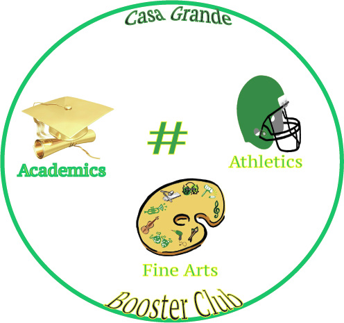
For this project i did a logo for the Casa Grande Booster Club. Janet Kinahan the Booster club president for this club wanted a new traditional logo using the the schools name in the logo so people still know that its still part of the school and not something else that doesn't have to do with this topic so she wanted a personal logo because she didn't want to keep using the schools boring logo no offense to the school but she wanted something that the students did and so that was what our project was about was to create a new and improved logo for the Booster club. I had fun creating this logo for the president of this club that really needed a new logo that they could call their own and not use Casas logo for theirs. what i did was I put football helmet, a golden graduation hat, and a painters plater for the fine arts. Then I made a circle, then put the first part of the schools name then i added booster club at the bottom rather then the top because i wanted to fill the bottom and not leave it empty and that would make it boring looking and i don't think thats what she really wants after that i put a hash tag in the middle of the logo so it wouldn't be blank i mean thats not what i would wanna see on a logo that i created or someone else created for me to put on things that i wanna show the world. Then finally i put three of the main words of the logo academics, fine arts, and athletics. And thats what i did for my logo i created for the Casa Grande Booster Club.
